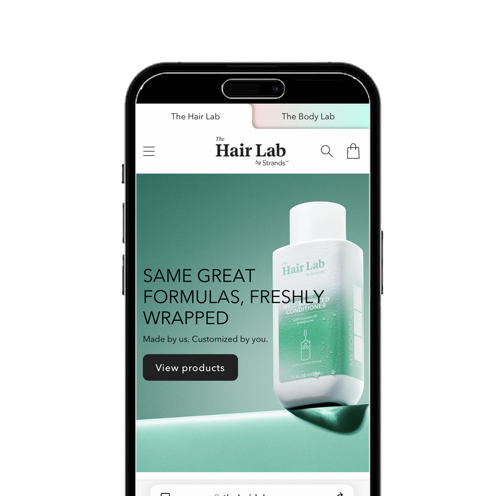
The Hair Lab Rebrand
Evolving the idea of customization for a new generation
Based on qualitative surveys with our Gen Z audience, we began to understand that the brand was perceived as sterile looking and worse, their “parent’s brand”. An update was needed to resonate with a younger audience and communicate the idea of customization in a more intuitive way.
We began with an update to the stock Boston Round shape of the bottles that the brand had become known for. The goal was to maintain continuity with the current brand’s visual equity but to disrupt with a custom bottle that inverted the concept and created a larger billboard and size impression on shelf. The result was an ownable, custom shape, multiple visual metaphors for mixing formulas and a refreshed user experience that updated the color pallet and refreshed the minimal look of the brand. The project was topped off with an updated brand guide showcasing the new product design and colors.
The new look
The idea of customization becomes more intuitive through the use of bold gradients against the brand’s traditional white background. We also increased the size impression and ergonomic function of the bottle for a better shower experience.


Credits
Robert Efurd
Creative Direction, Package Design, Art Direction of Photography and Video, Site Design, Brand Guidelines


