DevaCurl Rebrand
A ground-up reimagining of an industry standard
Since DevaCurl launched almost three decades ago, the industry has changed completely. Natural hair went mainstream and has become acceptable in the workplace where as before, it was seen as unserious and unprofessional. From the beginning DevaCurl was the lone voice in the wilderness advocating for empowerment and authenticity with natural hair. Over the years the market became flooded with brands that cater to curly and textured hair and messaging went from marginalized to mainstream and affirmative. The question we had to answer was: did culture change the category or did the category change the culture? As a brand we were confident that we drove that shift but we were quickly being drowned out by a chorus of voices.
One thing was for certain, we were the only brand that had a complete ecosystem built around authenticity, storytelling and organic growth, serving real consumers and real needs. All of this insight was carried over from my original brand audit and became the jumping off point for the new brand direction. With these assumptions, we spearheaded the most ambitious rebrand I have lead to date. Where it takes most brands 18 months to bring a new product to market, we seized the opportunity to reimagine and reformulate EVERY product in the line to align with a fresh brand positioning in one year. We updated the product architecture and created fresh content for every platform to align with our new brand direction of YOUR LIFE. YOUR CURLS. YOUR WAY. Bringing this to life in such a short period of time required numerous partnership including Henkel for product development, rigid regulatory partners and almost daily meetings with our supply chain team. At the same time, the creative team was consumed with a new brand platform, a full ecomm refresh and a complete packaging update with the assistance of SchoolHouse agency. The challenge tested a very capable creative team and the results speak to the hard work and dedication of every team member.


The new look
Visually, we pushed curls to their most audacious limits reflecting the ever-evolving sense of style that has become the norm. Seen as extremely expressive, hair itself became an unstoppable force through action, styles and products to visually express the diversity and power of curls.


Packaging
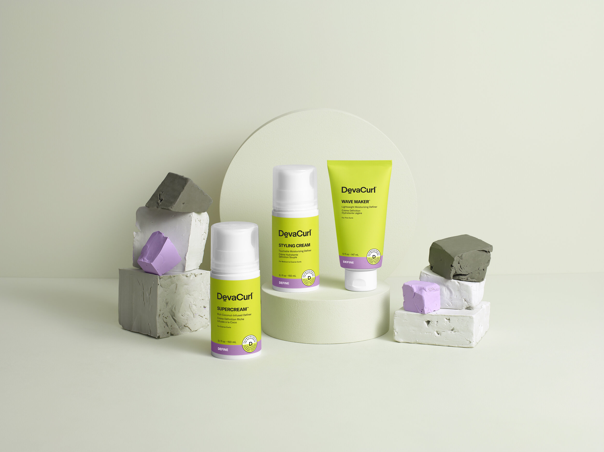
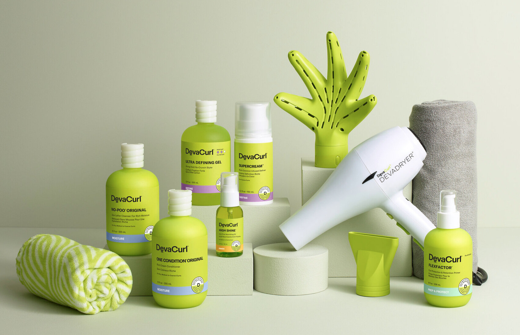
A more intelligent use of the signature green enhances color codes for franchise shopability. Custom caps and silhouettes were designed to ergonomically reflect the way people use the product. In addition, since all packaging is from recycled material, the art direction and props reflect cast-off and reused elements.
Brand Video
Product Usage


